This time around, I’ve documented the process I used in making my most recent map, so I can share it with the rest of you.
Here's the resulting map:

Step 1: Draw a rough plan

Step 2: Change Preferences
 Under the Photoshop preferences
(Edit > Preferences > General), change the settings for “Image Interpolation” to “Nearest Neighbour”.
The shapes we will be dealing with soon will have extremely hard edges with no anti-aliasing. Changing this setting will make it easier to scale and rotate our shapes without losing those hard edges.
Don’t forget, however, to change this back afterward, since it is not usually the preferred setting when working on other projects.
Step 3: Generate Land Masses
 This is one of the major techniques of this tutorial - the “jezelf” method. You’ll find a link to his specific tutorial in the description below.
The technique is fairly simple. Open a new canvas, and hit the D key to reset your foreground/background colours to black and white respectively. Then use [Filter > Render > Clouds], followed by [Filter > Render > Difference Clouds] a couple times.
Once you’ve got a nice random pattern on your canvas, use [Image > Adjustments > Threshold]. This will separate the image into strictly black and white regions, with no inbetween. Adjusting the slider in the window that comes up will allow you to shift where the distinction between black and white is drawn.
Ultimately, you should find a canvas full of shapes that look a lot like land formations. Often I’ll create several canvases of these.
Step 4: Build your Coastline

Step 5: Outlines
 Good maps tend to be very intricate, but the added details are often derived from the land shapes. This includes several levels and layers of outlines of varying thickness wrapping around the outside as well as the inside of the coastline.
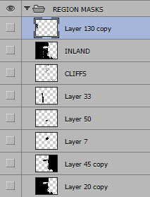 This is where creating an extra folder of individual "masks" comes in very handy. What I mean by this, is to create individual layers each containing a different filled region of land. You can then easily CTRL+CLICK these layers to create a selection marquee around their contents.
Use these marqees, along with [Selection > Modify > Contract/Expand] and [Edit > Stroke (Inside/Outside)] to create the outlines along the coastline.

I've added a fair bit more detail here - cliffs, outlines, etc. Just a lot of repetitive grunt work.
Step 6: Value and Texture
 Over a lot of experimentation, I've found that making the land lighter than the water to produce a pleasing effect that causes the seas to recede in the image. The outlines and blurred shadows also help to push the water sections back.
You can apply a bit of overall paper/parchment texture here too, but be subtle. Do NOT add anything too busy, especially at this stage.

Step 7: Colour

The colours you choose are really up to you. A few common-sense rules: bluer hues should be reserved for water. You don't have to use them for water, but if you're going to use them at all, try not to confuse your viewer by using them for land.
I didn't feel too confident about this colour scheme initially, but I was pretty locked in, since this is supposed to be based on a terrible map I made seven years ago. However, note how the golden colour makes the land seem very dry and desert-like. The colours you use will start implying things about the regions you're depicting.
Step 8: Decals

In order to really bring a map to life, you absolutely have to use decals. If you have the patience to draw these individually by hand, I'd take my hat off in respect (were I wearing one). Unfortunately, I do not have the patience of a saint. As with most of my details, I opted for a fairly subtle approach to decals - I use value to hint at things instead of careful linework to explicitly communicate. This approach worked well enough here, but it may not in other situations.
 Regardless of which method you choose, you're probably going to want to use custom brushes to quickly cover large areas with repeated elements (crude drawings of trees, mountains, etc). Don't stick to one brush for each type of decal (might get too repetitious) but don't worry about creating too many brushes. Here, I used three for each type (Mountains, Hills, Trees). One important thing about applying these decals, however, is not to apply them as a stroke - that is to say, don't drag the cursor across the screen, putting down as many marks as possible. Place each mark separately, and thoughtfully. Because we're not drawing in each detail individually, it is all the more important that we be attentive to how the repeated shapes play amongst one another.
Step 9: Climate

As I mentioned before, the colours you use can imply different types of climate. Consider using this to your advantage by overlaying large areas of colour over different sections of your map. Be sure to keep the opacities of these layers low though, you don't want to be too dramatic in these colour shifts.
Step 10: Extra Details

This may or may not be relevant to you, but a major feature in my map was a town, so I chose to get in there and draw out a lot of square shapes to hint at structures. I find that this, along with details like the little house-shape embedded in the northern forest, helps make your map more personal and relatable. In the past, I've added little unique drawings in the water of ships, sea serpents and krakens. These details should ALWAYS be unique, and never be repeated as we did with the mountains and trees.
Step 11: Text
 As with most things, text is not always necessary, but it does help push the illusion of a map that might be used by a traveller. Just make sure you don't write anything that might be seen as out of place. I like to outline my text with an opposing value (dark text, light outlines). Note that the outlines don't stick to the letters, but rather are spaced out a bit.
Step 12: Conclusion

The rest is just details. Some suggested that the city lacked a fresh water source, so I added a lake - this also had the added benefit of filling an otherwise empty area on the map.
Borders, titles, smudges and smears all help, but use them in moderation.
Thank you infinitely!
ReplyDeleteYou are most welcome! Infinitely!
DeleteGreat tut ! Could you give us details about how you're doing your cliffs ?
ReplyDeleteThanks. For the cliffs, I'd rely on the selection masks for all of my major land regions and the Edit>Stroke function in Photoshop.
DeleteYou can change this up quite a bit, but I find that cliffs look pretty good if they're represented by two lines - one right at the edge of the land region, and one a good distance back (achieved by using the Select>Modify>Contract function, followed by another Edit>Stroke). Then for the perpendicular-ish lines joining the two long strokes, I... just did those by hand. Lots of repetition.
Aside from that, I added a few other radiating strokes along the region's edge that fade off, using the same method. I inverted the selection, contracted it then stroked. And repeated that.
Needless to say, each time I stroke the selection, there's a good chunk of it that has to be erased, since it'd stroke all the way around the selection, not just where two land regions meet.
Hope that helped.
WOW !
ReplyDeleteThanks Alot... Really Great Tutorial Here's...
Keep Up Bro ^_^
This is a great tutorial, I've bookmarked it for future reference. Thanks for sharing it on /r/worldbuilding!
ReplyDeleteGlad I could help.
Delete